Riding The Subway And Research Methods

Lulu LuMarque
Lena Kaur
Brandon Marshall
Team
Timeline
January - March 2023
Role
UX Researcher
Project Lead
For a research class project, my team conducted research for the Chicago Transit Authority (CTA). We intended to improve its usability, design, and efficiency. The research methods we used were heuristic evaluations, cognitive walkthroughs, interviews, and more.
Problem
Goal
Provide recommendations to make the CTA’s website more efficient for users.
Our team wanted to understand the challenges and incentives for using the CTA and how riders felt about the CTA. During this phase, we also performed a Heuristic Evaluation and Cognitive Walkthrough highlighting the positives and pain points of the CTA’s website.
Usability Evaluation
Cognitive Walkthrough
Created a scenario that went through the steps of finding the best route from the Loop to Chinatown.
Result
The user is able to efficiently find the best route, with minimal confusion. The biggest pain point would be pressing the “Google Maps” button to receive the directions. The recommendation is to change the button title to “Get Directions.”
Heuristic Evaluation
Used Nielsen’s 10 heuristics to evaluate CTA’s website.
Result
Overall the website is usable, but there are some pain points. Specifically the sections of Quick Trip Planner, Bus Tracker, and External PDFs. One recommendation is to add breadcrumbs to the Bus Tracker.
The methods used to conduct the User Research were Interviews, Affinity Map, User Personas, Site Maps, and Interview Protocol.
User Research
Interviews
Our team interview 8 CTA riders
CTA riders mainly use Google Maps, Apple Maps, or Ventra App for CTA trip routes
CTA riders felt safer on the CTA during the daytime
CTA riders wanted to see alternative routes for trips in the case of delays
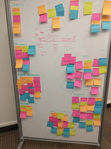
Affinity Map
Cluster were created based on Preference, Safety, Improvements, Frequency, Other Websites or Apps,

User Personas
The personas were derived from the results of the interviews.
Mathew Watson

Lisa Williams

Before starting the Usability Testing our team created a protocol with the five testing objectives. Each tasks were ranked by severity. Each of the following testing objectives were the most severe. The CTA Fares and Alerts were minor to no recommendations need.
Usability Testing
Quick Trip Planner
Pain Point
Users were confused about the meaning of the bullseye symbol and the meaning of it. As well as a lack of verification when picking a location. The biggest pain being a misunderstanding of what Google Map button does.
Final Recommendation

To solve the bullseye pain point, it would be best to remove it entirely. As for the verification, the solution would be to give the user some sort of verification they have entered the correct address. Maybe add a check mark symbol. Finally, to fix the misunderstanding of the Google Map button, make the title button “Get Directions” and put the position of the button higher up.
“I would rather just use Google Maps than go to the CTA website just to use Google Maps.”
Tracker System
Pain Point
During testing, users had a hard time finding the tracker system which led to a lot of uncompleted tasks. We learned that there was a lot of confusion on the meaning of “Tracker” and “Schedules”.

Final Recommendation
To solve the confusion on the meaning between “Tracker” and “Schedule” it would be best to either combine the two pages. Another option is to make a distinct separation between the two.
“Trackers is not the greatest term”
Contact Feedback
Pain Point
Due to information overload and the placement, it was hard for users to locate the Contact Us button.

Final Recommendation
To make the Contact Us button more visible, the CTA could increase the font size. The button could stand out more if they changed the color from white to maybe their branding color of red.
“I got lucky with that one (finding the Contact Us in the navigation bar)”
Key Takeaways
Communication
From this project, my communication skills improved. I focused on checking on each team member. Through this I was able to empathize better with the each team memeber and with the users too.
Adaption
This project taught me how to be more adaptive to changes which is essential for interview facilitators. It showed me to welcome uncertainty.
Research
I have learned many skills in research from this project. I have developed my skill as a facilitator in a usability test. Another skill this project taught me is how important it is to understand the usefulness, effectiveness, efficiency, satisfaction, and accessibility of an interface.
