
Access For All
January 2025 - Present
Team
Mia Johnson
Role
Timeline
The Chicago Center for HIV Elimination needs a website that will update their branding while aligning with the University of Chicago’s branding. As well as having concise information that prevents information overload.
Problem
UX Researcher
UX Designer
Create an interface redesign that aligns with branding guidelines of the organization and University of Chicago while providing an efficient and accessible experience for users.
Goal
Our team wanted to understand the challenges and incentives for using the CTA and how riders felt about the CTA. During this phase, we also performed a Heuristic Evaluation and Cognitive Walkthrough highlighting the positives and pain points of the CTA’s website.
Usability Evaluation
Cognitive Walkthrough
Created three scenario that went through the steps of finding key features of the CCHE website.
Schedule a HIV testing appointment
Making a donation to CCHE
Finding information about requesting Safe Use Kit & Narcan.
Result
It was discovered that it took too many clicks for clients. All three of these features needed more visibility on the website.
Heuristic Evaluation
Used Nielsen’s 10 heuristics to evaluate CCHE’s website.
Result
As for the Heuristic Evaluation, there were minor fixes that needed to be made for consistency. To streamline the appointment feature, we spotlighted the link to make an appointment in the hero of the landing page. This way it limited the time to find the link on the website.
The methods used to conduct the user research were user interviews and personas.
User Research
Interviews
Our team interviewed 8 users.
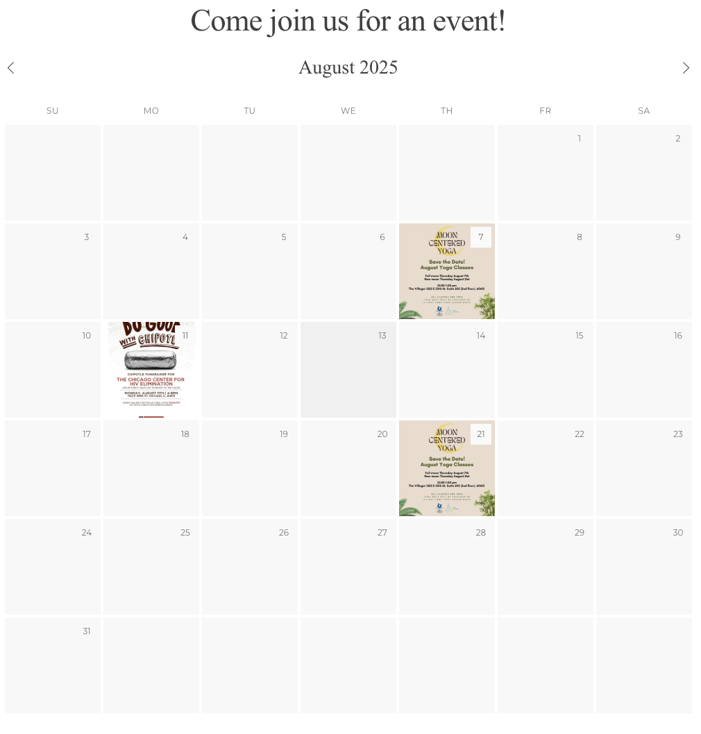
use to access calendar events.
to donation to CCHE.
scheduling or contacting CCHE for testing appointments.
User Personas
User Personas were utilized during this redesign to keep a connection and understanding with who the users of the website are. Including this, it was used to maximize empathy with Staff, Clients, Partners, and Donors. This way the Design Team could best understand their pain points and motivations of each unique user.
Anthony Michael (Client)

Michelle Taylor (Donor)

Maddie Carson (Donor)

Lydia Hart (Staff)

Before starting the Usability Testing our team created a protocol with the three testing objectives. We wanted to learn how users booked appointments, see the CCHE event calendar, as well as what is included in Safer Use Kits.
User Testing
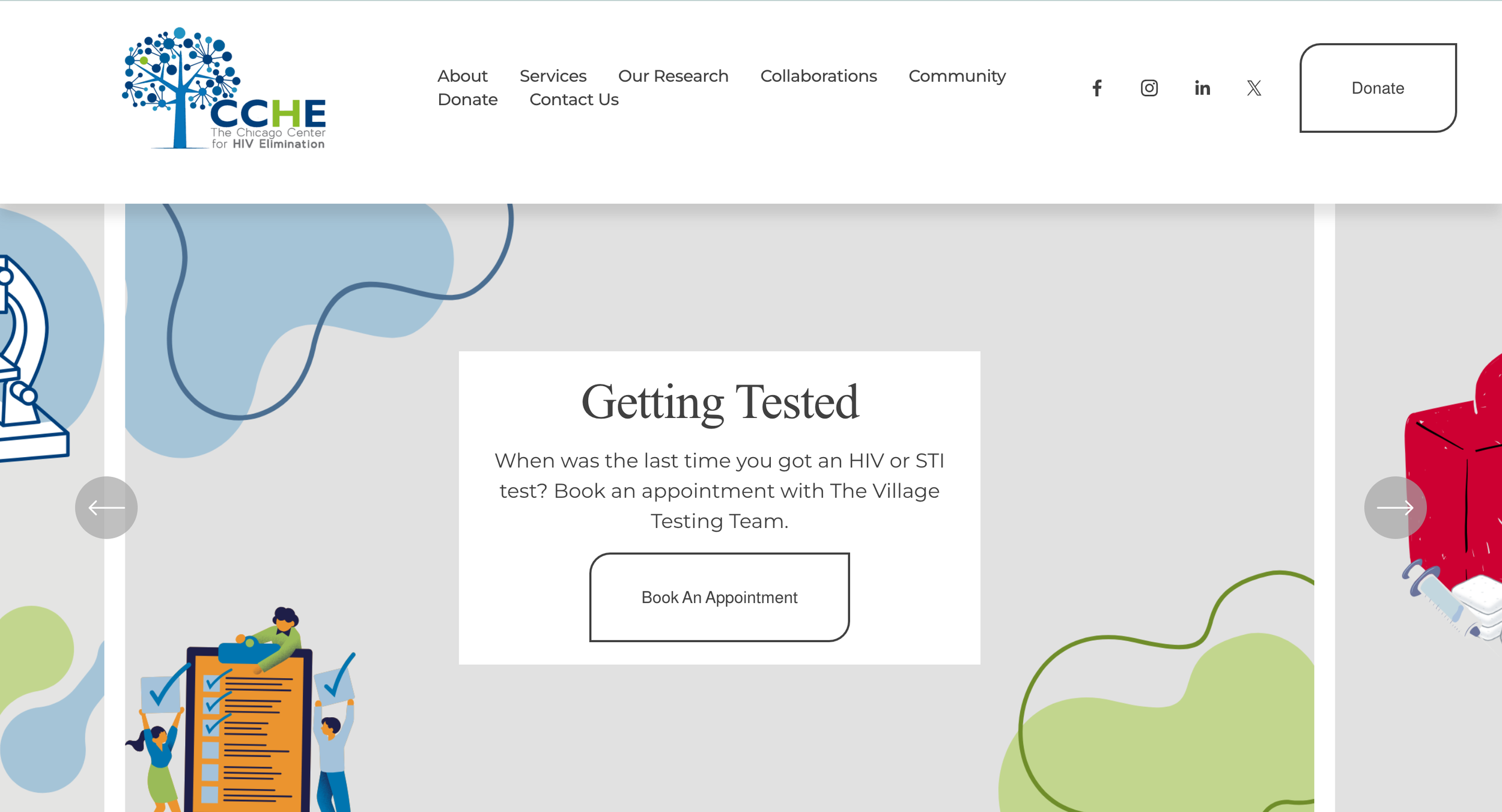
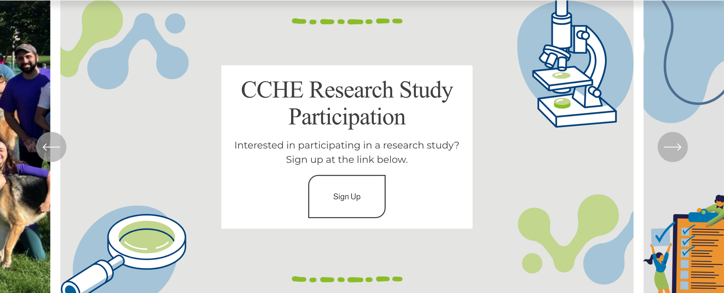
Hero Section
Pain Point
There was no efficient and streamlined area to access CCHE’s most important information like the calendar, appointment booking, or their safer use kits.
Solution
Create a hero section that will move at an allotted amount of time. This area will hold the organizations information they would like to highlight like their event calendar, booking testing appointments, research study registration, and their safer use kits.

Key Takeaways
Efficiency over aesthetic
During this project I learned that sometimes you need to prioritize how the feature will work over what it may look like.
Less is more
I learned that solutions do not need to be extravagant out of the box solutions. Sometimes they are as simple as spotlighting what is needed right in the users first five seconds of viewing.